March 09, 2009
Another Knot
This is the process I used to create a logo concept for a department downstairs. The desired object for the logo is an anchor, but we're trying to communicate the same idea of being well-grounded while steering clear of marketing cliches. So, we're toying with other nautical imagery that plays on the same ideas/functions/goals of the department.
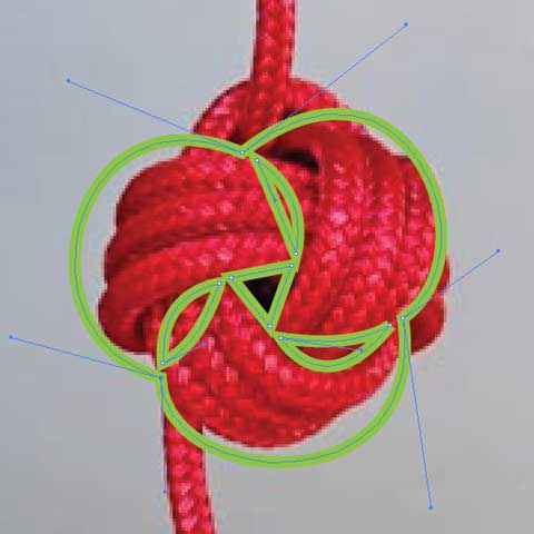
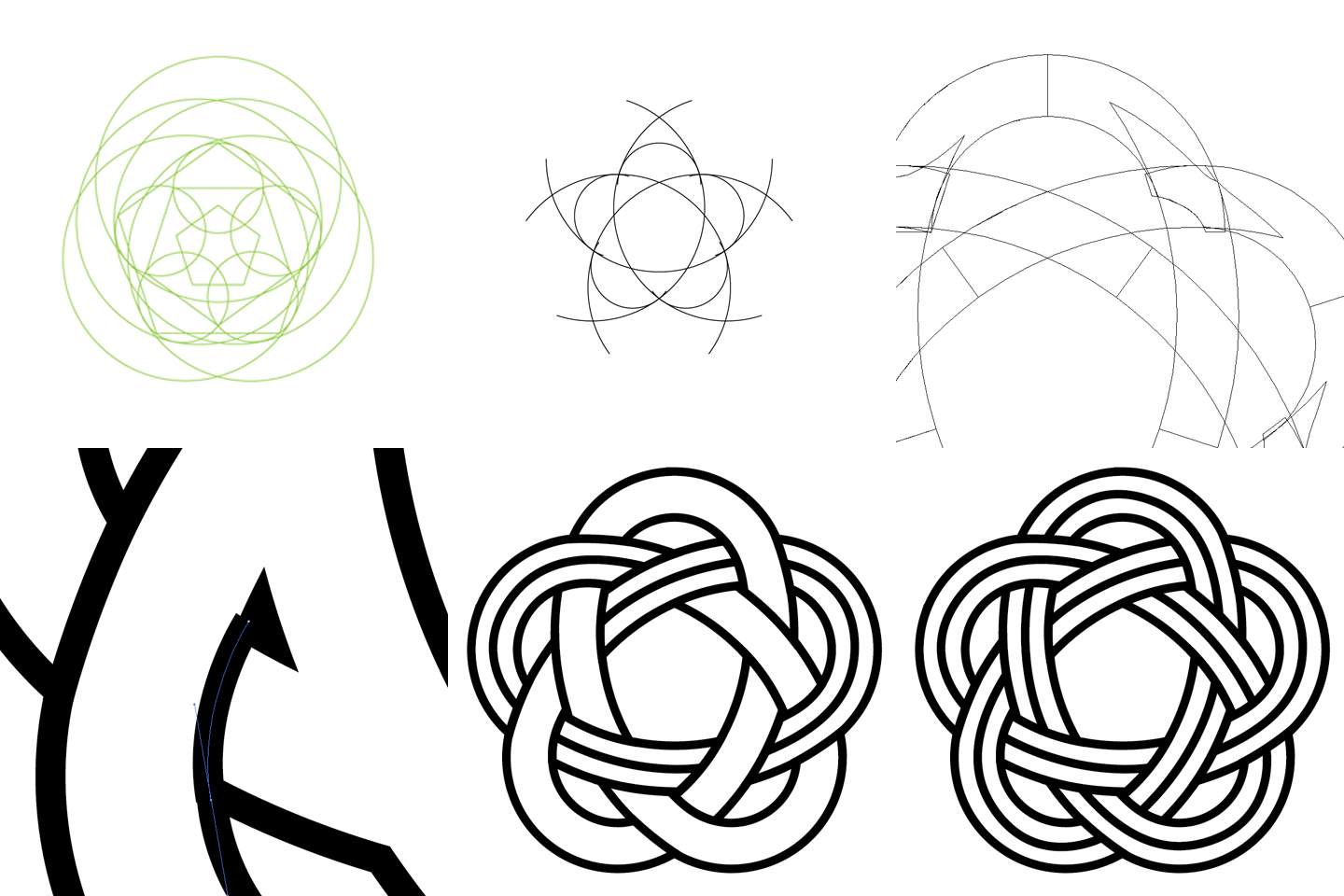
One idea is to do something with knots. I'm going to show you the drawing phases I used to create a mechanically flawless monkey fist knot. Monkey fist knots look cool.
Below is the rough trace of the knot so I can get a feel for how a more stylized version might work out.

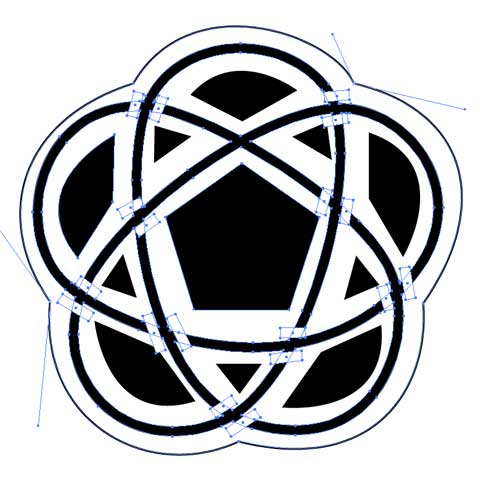
Then I figure out how I want to make the final one look. This is the rough sketch version.

And now, for those of you who are already tired of scrolling down, a short animation depicting the final steps to completion:

March 05, 2009
Office Parties
Today we celebrate the Office Workaholic's birthday! Accordingly, I've made a quick card to pass around among the coworkers to record their congratulations and best wishes.
